
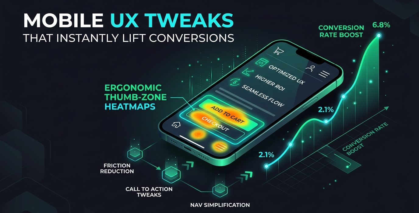
Mobile UX conversion tweaks—such as placing primary CTAs within the natural thumb zone, enabling one-tap native mobile payments, stripping secondary navigation clutter, and eliminating cumulative layout shifts—can lift mobile conversion rates by 25% to 60%. Despite mobile devices driving over 65% of all web traffic, desktop conversion rates remain more than double mobile averages due to unresolved interface friction.
Most landing pages are designed and approved on large desktop monitors. Business leaders review beautiful wide layouts without realizing that when viewed on a smartphone with one thumb, the user journey becomes a frustrating obstacle course. Optimizing for mobile ergonomics is the highest-leverage conversion lever available to modern marketers.
The Ergonomic Thumb Zone Principle
Over 75% of mobile users navigate smartphones using a single thumb. Research compiled by UX design authorities confirms that the natural reach of the human thumb covers only the lower-middle third of the mobile screen. Placing critical action buttons at the very top of a mobile viewport introduces severe physical friction.
| Mobile Screen Zone | Physical Reachability | Optimal UI Element |
|---|---|---|
| Natural Thumb Zone (Bottom Center) | Effortless single-thumb tap without repositioning hand | Primary Action Button, Sticky Checkout Bar, Add to Cart |
| Stretch Zone (Center / Middle) | Requires slight thumb extension | Product images, key benefit bullets, social proof badges |
| Hard-to-Reach Zone (Top Corners) | Requires shifting grip or using a second hand | Secondary navigation, logo, non-urgent legal links |
4 High-Impact Mobile UX Adjustments
1. Implement a Persistent Sticky Bottom CTA Bar
As visitors scroll through long informational sales pages, the primary CTA often disappears off-screen. Implement a lightweight, sticky bottom bar that anchors the primary action button to the bottom of the screen. This ensures the user can convert the precise instant they feel compelled without having to scroll backwards.
2. Enable Native Digital Wallets (Apple Pay & Google Pay)
Typing a 16-digit credit card number and billing address on a mobile keyboard is the primary trigger of mobile cart abandonment. Integrating native digital wallets reduces checkout friction from two minutes of tedious typing to a single biometric confirmation, directly lowering your customer acquisition cost.
3. Strip Visual Jitter & Optimize Mobile Web Vitals
Mobile users on cellular networks are exceptionally sensitive to latency. According to benchmarks in Google Core Web Vitals documentation, every second of mobile load delay reduces conversions by up to 7%. Eliminating render-blocking scripts and ensuring stable visual loading prevents accidental miss-clicks.
4. Align Mobile Intent with Desktop Experience
Ensure that mobile experiences mirror the messaging promised in search ads. As we discussed in our guide on landing page friction points, maintaining exact message match is just as critical on mobile screens as on desktop monitors.
Frequently Asked Questions
Does improving mobile UX directly help search engine rankings?
Yes. Google utilizes Mobile-First Indexing exclusively. Sites with severe mobile usability defects, slow mobile load speeds, or intrusive mobile popups are actively penalized in organic search results.
Should we remove content from the mobile version to make it faster?
No. Hiding critical informational content on mobile can harm your organic rankings. Instead, optimize code efficiency, compress media assets, and use collapsible accordion components to keep pages scannable without deleting content.
Conclusion
Mobile conversion rate optimization is not about aesthetic redesigns; it is about respecting human anatomy and user context. Fine-tuning your mobile touchpoints ensures maximum return on both organic and paid traffic. Explore our mobile-first web design services or request an audit from our conversion rate optimization specialists today.
[…] One of the most persistent design errors in modern web development is the auto-rotating hero slider. User testing studies consistently show that rotating sliders suffer from less than 1% click-through rates. They introduce cognitive distraction, induce visual banner blindness, and cause layout instability (CLS) that harms mobile usability as discussed in our guide on mobile conversion optimization. […]